Blog: Less is More in Graphic Design
Over my 30 plus years in graphic design inevitably I've had to deal with clients who seem to think they are paying for graphic design by the inch. Whether it’s for a business card, website, magazine ad, or billboard, they are constantly wanting to put just one more thing into the design to fill ALL the space… and then maybe just one other thing too just in case.
What many clients don’t realize is that clutter doesn’t attract, it actually repels potential viewers. It’s never been more the case than in our current digital world that is full of visual chaos. We are inundated with banner and pop up ads constantly and have become accustomed to ignoring them. The more that is thrown at us, the more we visually turn it off. So, while you may think you are getting all 15 points in your ad across, the reality is you aren’t even getting ONE single point across. The visual appears as a gray blob to the masses who pass it over and then stop at the clean ad with a single bold message and visual.
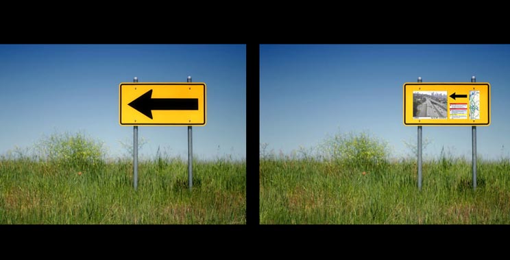
When teaching graphic design to college students I often use the visual of an over complicated traffic sign vs one with one single message. While we CAN add all sorts of information to a sign in the hopes of making it the most helpful traffic sign in the world, the truth is less is more when getting attention is vital (like on the freeway going 65 mph). So maybe the next time you want to add just “one more thing” to that brochure, stop and think about if that one more thing is going to make the overall design more or less appealing. If you’re not sure, maybe err on the side of less is more. In my experience, it almost always is.
— Hovie Hawk
< Back to Blog