Blog: 5 Things I Love About the Roboto Typeface
Typefaces are an interesting thing. They can help convey just the right tone and get your message across in the best way. Some designers love to use anything new and different and spend hours looking for anything they haven’t used before. I find this, more often than not, a waste of time. Rather I like to have a solid core of 5 sans serif and 5 serif typefaces that I use 90% of the time. I know them well and can concentrate on spending my time crafting the best possible graphic design solutions in other avenues. That being said over the past 5 years or so a new one has crept into my arsenal Roboto. Here are 5 things I love about the typeface:
1. It’s a free Google font, super easy to get and use for both you and for your clients
2. It has both serif and sans serif versions that work well with each other
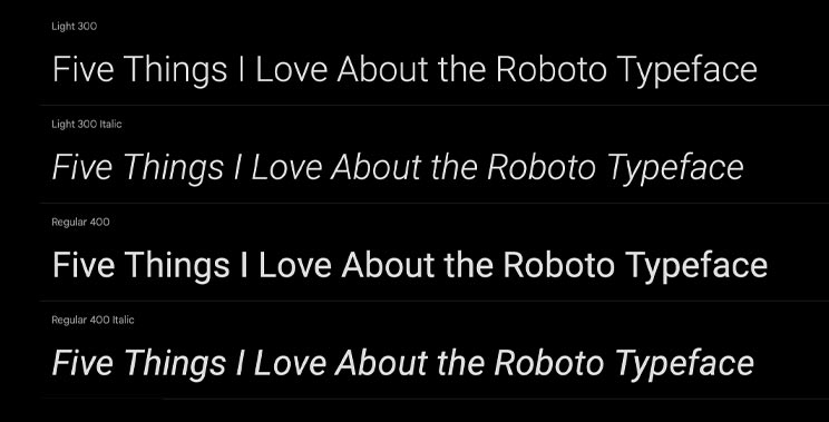
3. It has multiple weights in both the serif and sans serif options making it one of the most versatile typefaces out there
4. It’s clean and timeless. Slightly more unique but similar to Helvetica it will allow your graphic design solutions to look fresh much longer than if you use a “font of the season”.
5. Its light version is very readable and works perfectly for body text while its bolder weights allow for a perfect contrast to the body text with big bold headlines.
Every graphic designer has their own system and many do very well chasing the “font of the season” but for me I like to let the overall design, image, type, graphic elements, craft the message and Roboto is one of my favorite typefaces for being a perfect part of the overall solution.
— Hovie Hawk
< Back to Blog